Basics of Color Encoding
“D E S I G N E R S P E A K ” IS R E A L W H E N IT COMES T O T H E C O L O R W H E E L.
I have put together a color encoding list aimed at developing your basic color vocabulary. The color wheel can be so much fun and at the same time, exuberantly profuse. These tips will help you arrive at the paint store knowing how to communicate your ideas more clearly and help you make better paint selections. Have you ever painted a whole room and thought the color was very different than you imagined? Choosing the right paint color can be painstaking and expensive if you don’t have a basic understanding. Lets begin with temperature- Color temperature refers to how colors make us think and feel. Yes that’s right, color evokes feelings and thoughts. I think that is the reason color is so magical. For example the color red, orange and yellow are warm colors correlating to the heat of the sun. In contrast, the colors that remind you of the ice, ocean, shade and moonlight are cool colors. Red mixed with a lot of blue will create a magenta. A red with yellow undertones will be an orangish flame color.


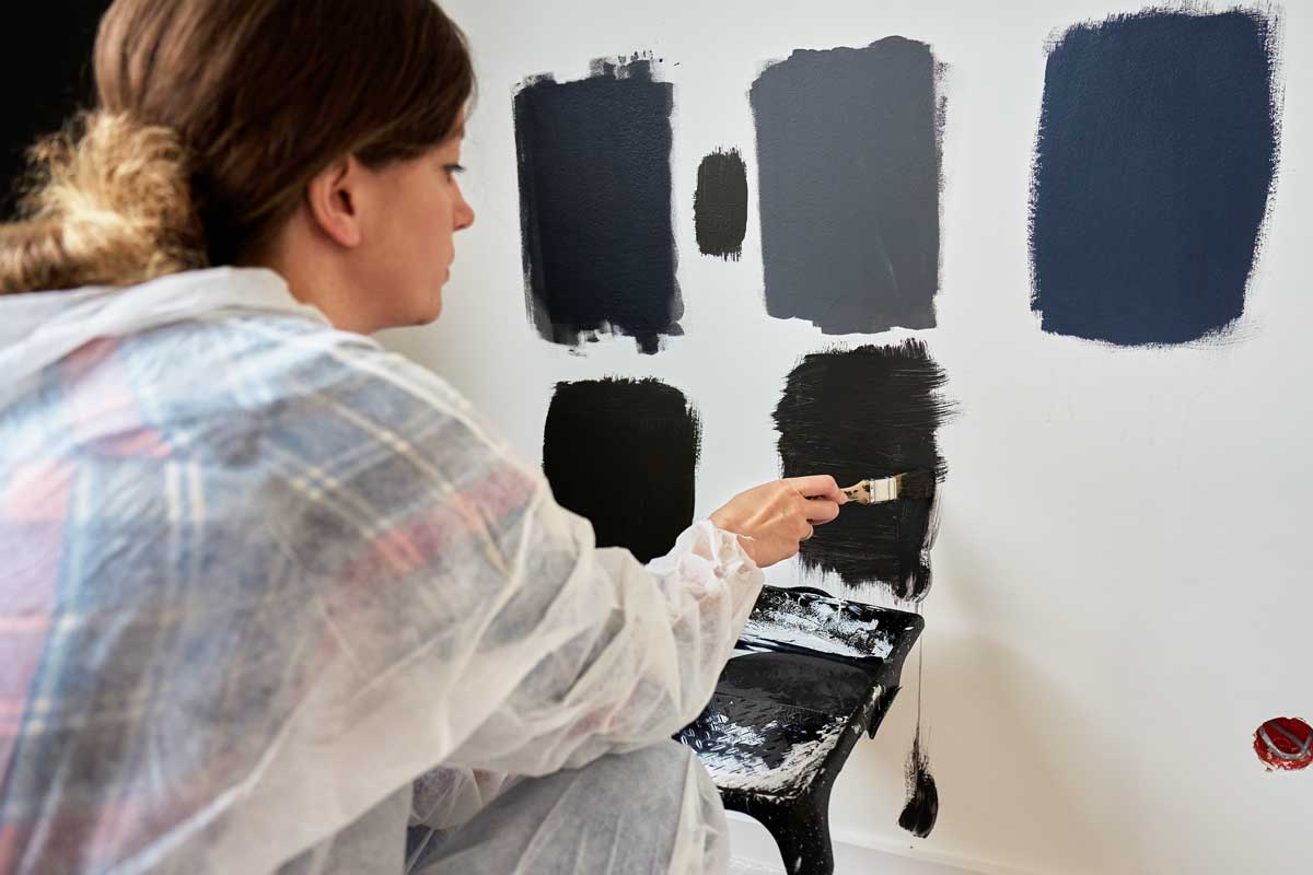
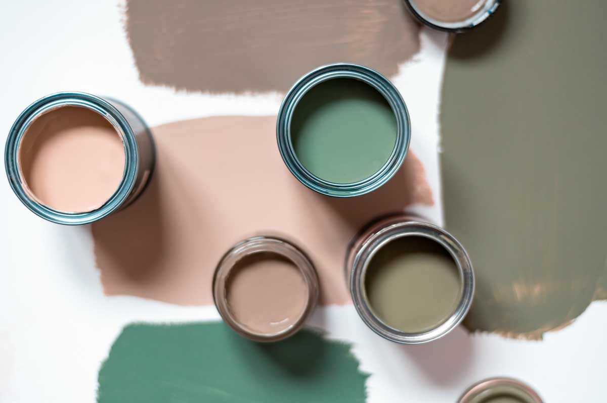
As a result, colors can be cooled down or warmed up depending on their undertones. There are other words that get tossed around in the color encoding world of an interior designer such as; Hue, Moody, Earth Tones, Jewel Tones, Matte, Tint, Shade(Values), Saturation and Tone. Lets begin with Hue which is pretty straight forward and is simply another word for color. Tint and Shade are Values in a single color from light to dark. Tint is a lighter paler version of another color by simply adding white to the base color creating a tint lighter of the original color. Shade is the opposite, where adding black to the base color creates a shade darker than the original color. The word Moody is often used to describe deep, dark saturated colors. Think of shadows, wood, cozy, deep browns, scarlet, charcoal and eggplant when describing the feeling of moody. Earth tones are my personal favorite are hues inspired by natural materials in nature such as brown, sandy beiges, grays, greens and terracotta. This does not mean bright colored birds in nature however think instead of trees, rocks, sand, and light green trees.
A really popular color trend right now is Jewel Tones, which are super rich and deeply saturated colors often described as gemstones. Think of emerald, jade, turquoise, sapphire and emerald when you imagine Jewel tones. Saturation is a level of intensity in color. When looking at the color wheel, the colors found on the outer edge are higher in saturation. Think of deep rich ruby red, emerald green and cobalt blue for high saturation colors. Matte refers to lacking in luster and using matte finish paint will reduce the light reflected on the wall. A matte finish will absorb light and makes it a good choice for covering imperfections. Choose paint in gloss to high gloss to achieve high luster on the surface. If you enjoyed expanding your color vocabulary you may enjoy a deeper dive into color coordinating and color scheme theory.
Check it out in my latest blog called Color Harmonies.

