
The 60-30-10 Rule
What exactly is a color palette and why is it so important?
The word COLOR PALETTE is tossed around like throw pillows but it is the most important element in interior design. The color palette principle is the group of chosen colors that will be used consistently throughout the space or an entire home. A color palette can shift from room to room but it must compliment, flow and blend cohesively. A color palette can feature three to five different hues. Hues are essentially the shades (adding black to the color to make it darker) or tints (adding white to the color to make it lighter). Most designers agree that four is the magic number, however some design styles call for more. As you consider wall paper, artwork, furniture, rugs, window treatments, pillows and other decorative elements the palette you choose will dictate what works within the space and doesn’t. It is too easy to make a room overly matching.
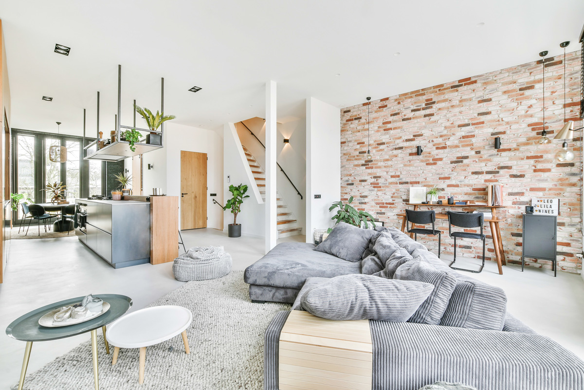
This is why choosing a few colors and placing the colors in a well-balanced way will provide depth, drama, contrast and an all-around cohesive style.
The main goal is to create a visually attractive mood and aesthetic.
The 60-30-10 Rule
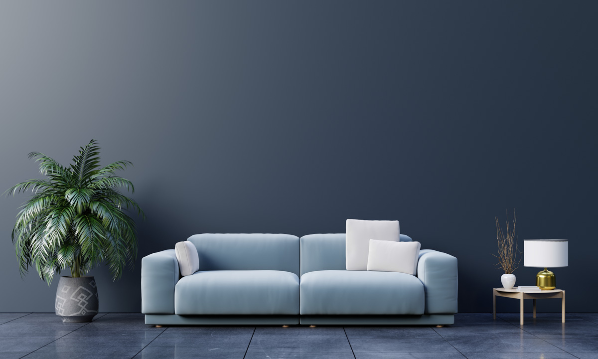
This formula divides the colors in percentages. One of the colors will be chosen as the most dominant color in the space and used throughout 60 percent room or home. This color can be used on walls, floors, upholstery of large pieces of furniture, and placed on large feature walls. The second most important color will be used in 30 percent of the space. This color can be used on an accent wall too, and on wallpaper, floors, furniture etc. The 10 percent color or colors are utilized in the accents (smaller elements such as art, pillows, throws etc, and are balanced with intentional placement within the space.)
Selecting an overall color scheme for your space or home will be the best way to bring it all together and ensure a cohesive design. When buying items be sure to use this simple 60-30-10 interior design rule.
